Food and Beverage: SVEDKA Vodka
Helping the nation’s #1 vodka brand go handheld.
SVEDKA is a major vodka importer into the U.S. and a staple in the vodka aisle. When the brand decided to extend into the Ready-To-Drink space with a premium sparkling spiked seltzer, I was responsible for developing the strategy to bring SVEDKA's premium, cocktail-inspired spiked seltzers to market.
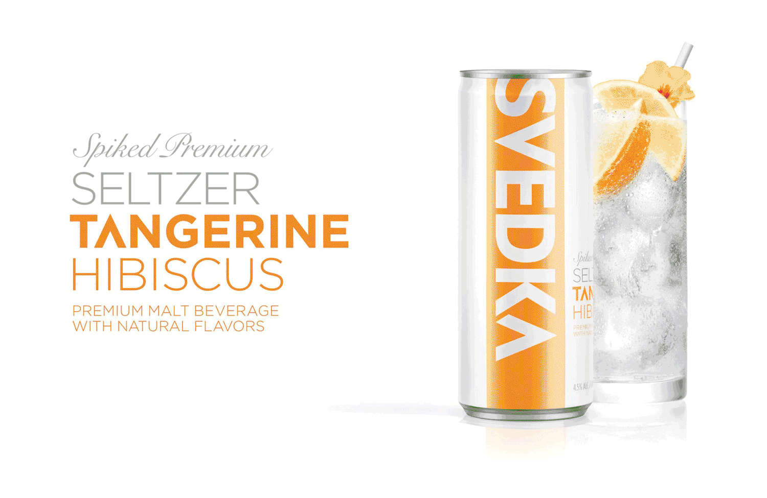
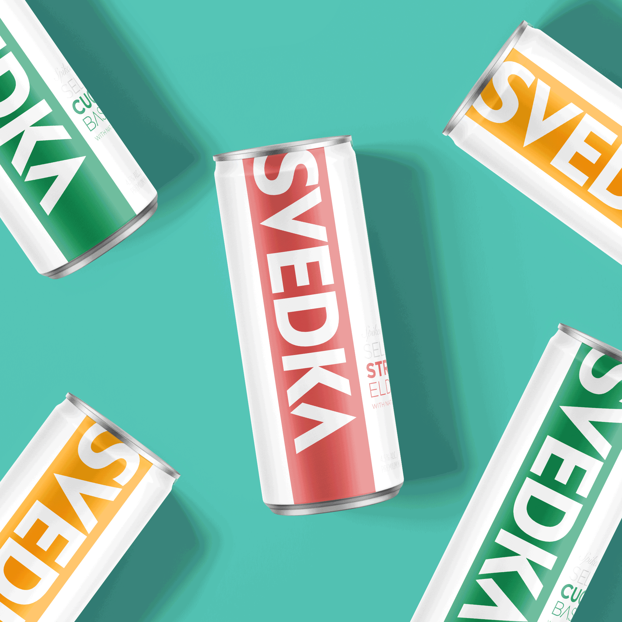
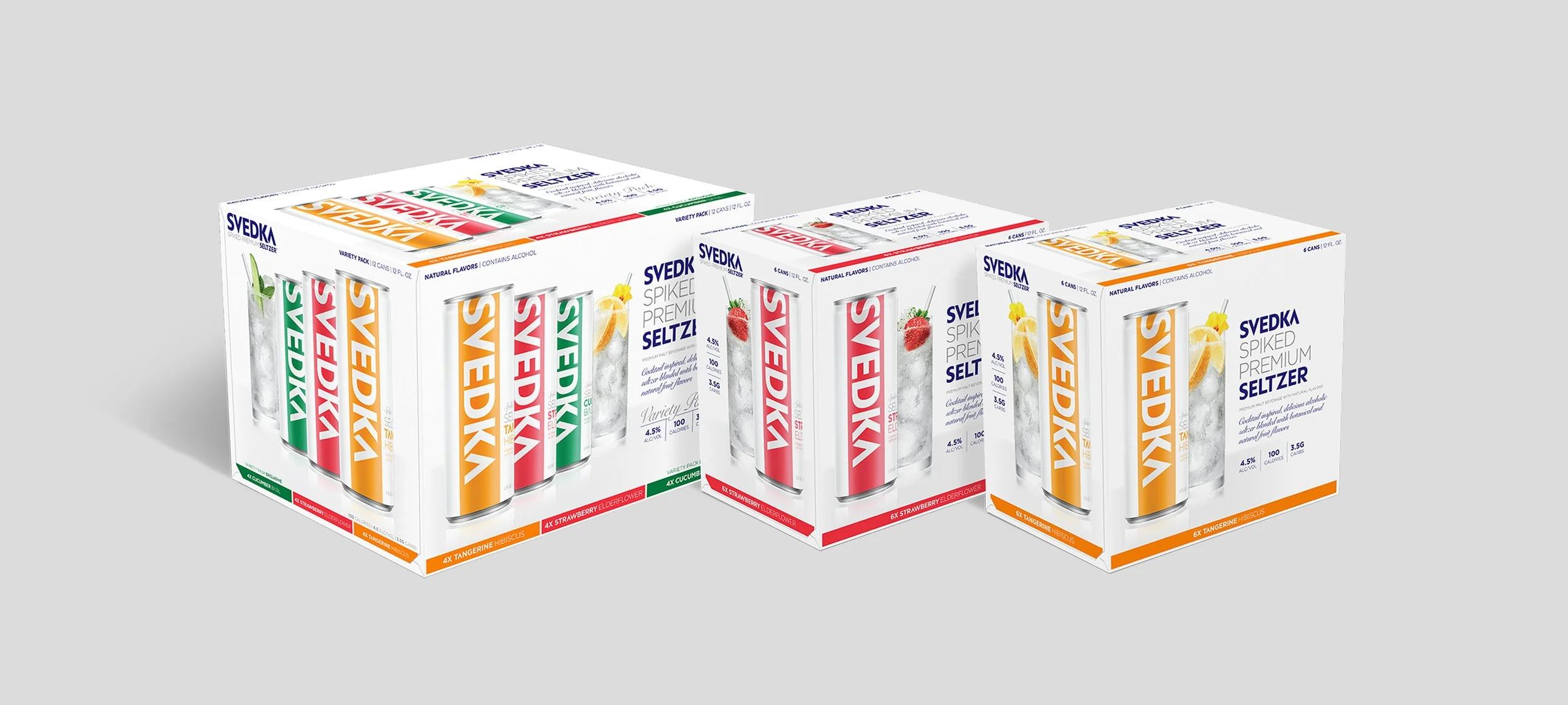
To attract seltzer loyalists as well as cocktail drinkers, I designed slim cans, bold graphics, and clean typography to create vibrant cans for shelf impact. The bold horizontal band that’s iconic to all of SVEDKA’s bottles is turned onto its side for an energetic and playful presence. Taking the band vertical made the branding larger than what you would see on typical aluminum cans, and cutting into the edge of the ’S’ gives the impression that the brand is bigger than the can itself. To keep things fresh, we leveraged asymmetry by stacking the flavor descriptors to the right of the branding, and contrasted thick san-serifs with more elegant scripts to give everything a contemporary and premium vibe.
Client
SVEDKA Vodka
Agency
WE ARE BRIGADE
Role
Packaging Design
Awards
Western Mass Ad Club Creative Awards (2020), GDUSA Package Design Awards (2019), Pentawards (2019)